informed
Reducing news overwhelm through design and curation.
I joined the media tech start-up as Head of Design & Brand, directing all creative work. After diving into existing user research and insights, I updated our brand strategy through async workshop facilitation and implemented a rebranding. We went to market with a well-loved app seven months after I started. We reached No1 in the German App Store and No3 on Product Hunt. We leveraged AI to produce summaries and article translations. I implemented the merger of all creative areas under my leadership and led a cross-functional creative department of five: product design, marketing design, copywriting and photo editing. A crucial part of my work centred around empowering and mentoring others. My proactiveness saw me promoted to the senior leadership team after five months.
Role: Head of Design & Brand
2022-2023
Key expertise: Design Direction, Creative Strategy, Cross-functional Team Leadership, Mentoring, Design Management

Informed curates and summarises world-class journalism from premium publishers ad-free (think New York Times, Reuters, FT…). They were combined in one app under one subscription. Daily Briefs, curated by an experienced editorial team, deliver quality content in an easy-to-understand format. Gone is the paywall pain and news overwhelm.
The landscape when I joined

A tech start-up in beta needed an updated brand strategy and updated personas, and because of said insights, a redesign was required. More clarity was crucial: Redefine hierarchies, less ornamental add-ons that aren't adding value, and less pastel that contradicts the magnitude of news coverage. New workflow and process implementations would help scale the brand and team.
Process magic


I conceptualised and led the async workshop facilitation on Miro to create our redefined brand strategy. The process involved the senior leadership team and the entire team at specific stages.
A rebrand is born
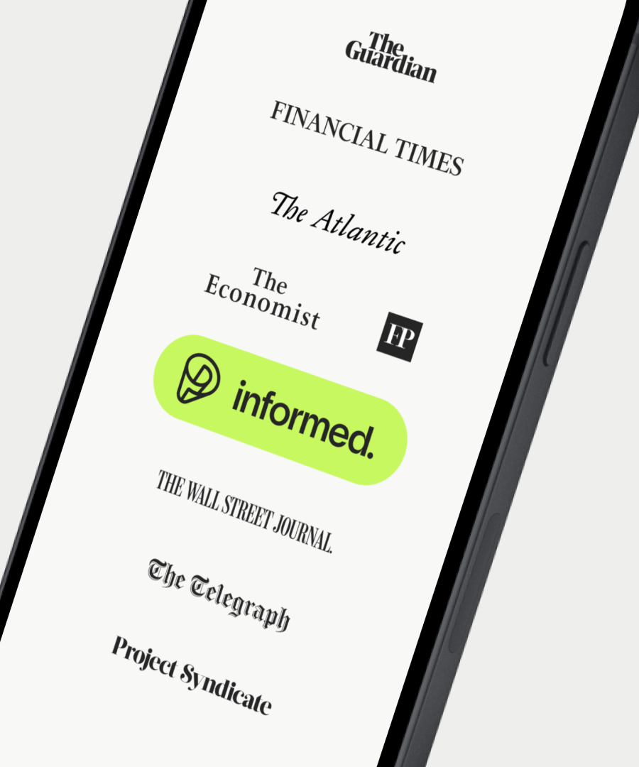
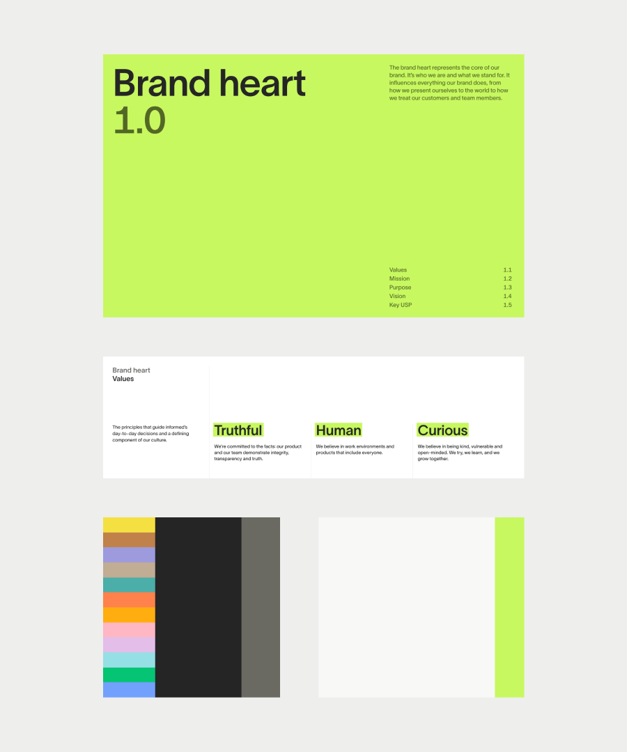
Cutting through the noise
We worked with A Color Bright on a brand redesign and aligned our visual identity with our new strategy and audience. The new branding showed the perfect symbiosis of known editorial principles and a contemporary digital spin on news consumption. It transformed our B2C app into a beloved platform, boosting brand recognition and customer engagement.
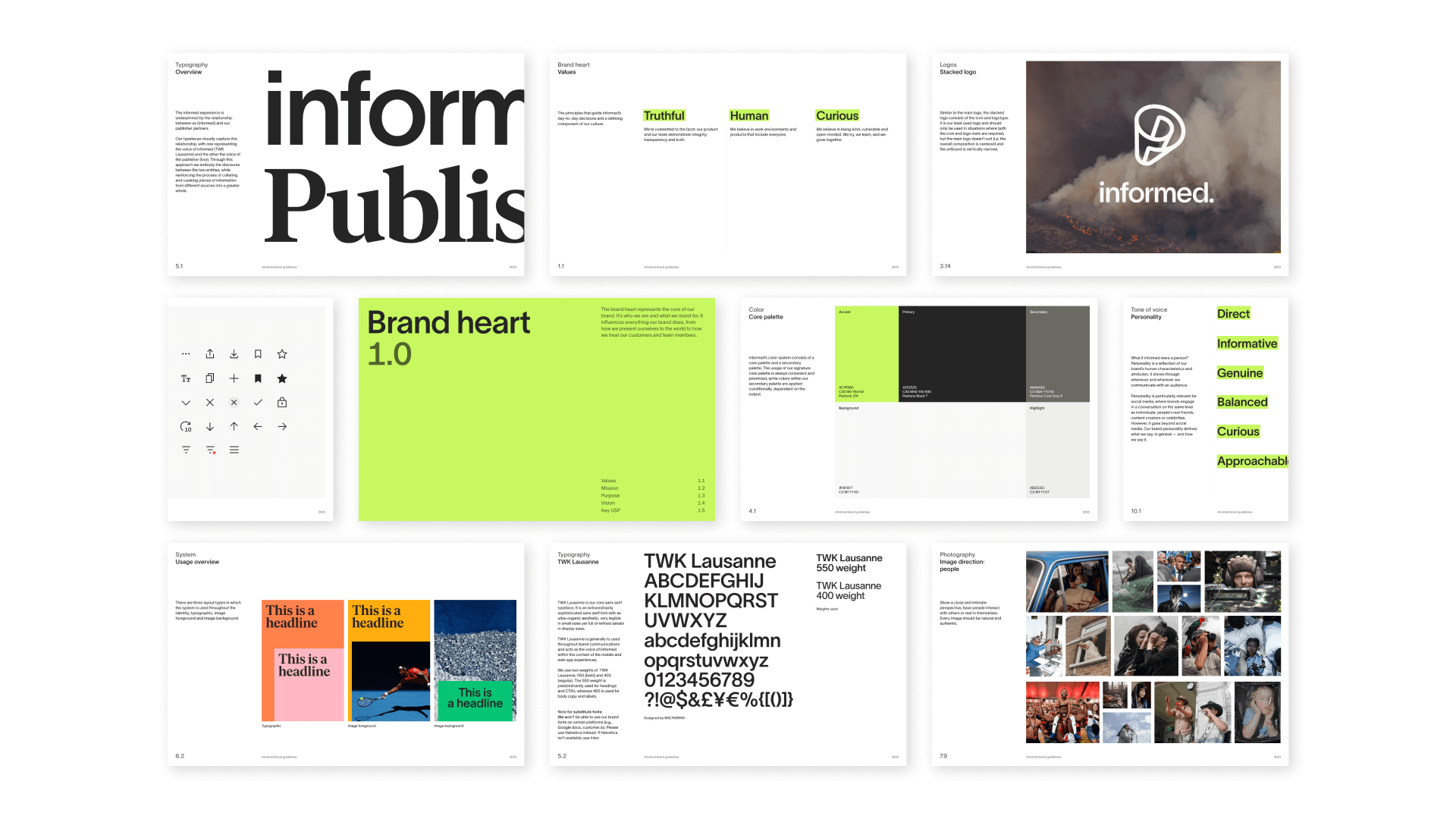
New brand guidelines
Spanning the entire brand universe from brand strategy to personas, from visual identity to tone of voice and editorial guidelines. From a new photography direction to iconography and how to apply everything in situ. For each team, I set up a tailored onboarding call and a bespoke Notion page with quick links predominantly used by each team: this increased engagement, faster workflows and adoption of the new brand language.
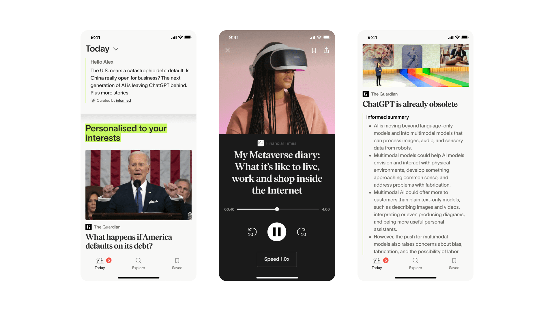
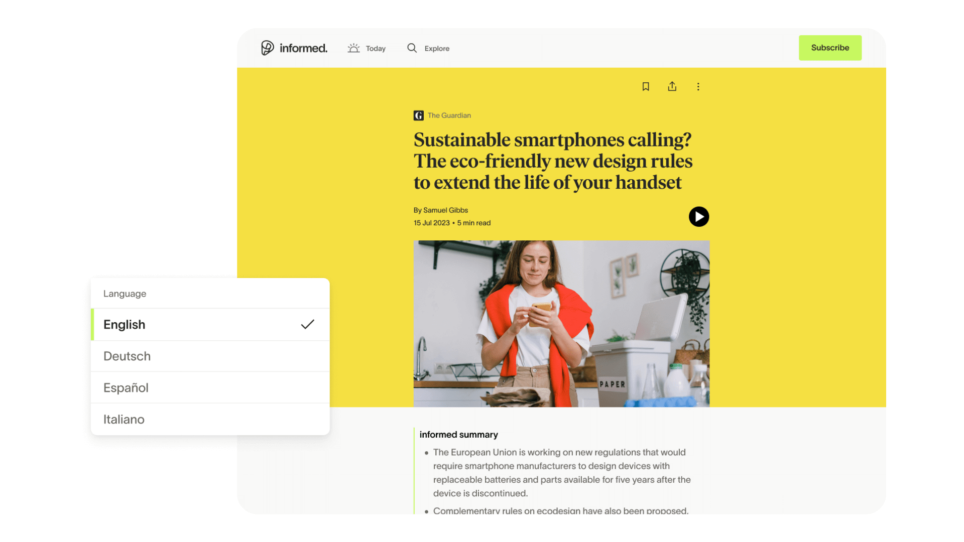
App & Webapp: Features, research, product management and growth
Based on thorough user research, we implemented features that were highly loved, such as audio options and AI-powered time-saving summaries and article translations. Everything was aligned with our mission to deliver informative, quality news and make it accessible to everyone, anywhere and at any time.
Go-to-market success

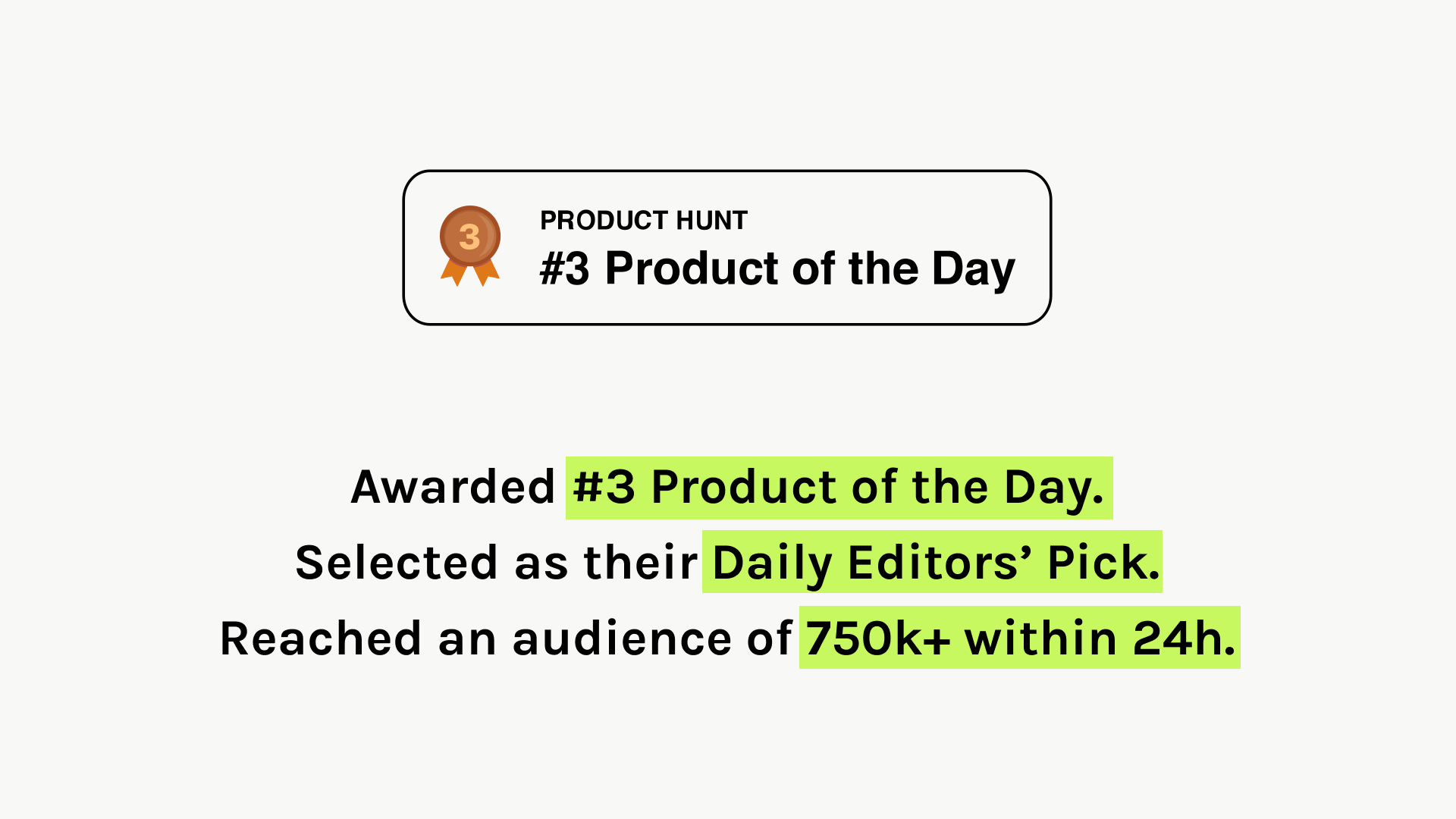
Product Hunt Campaign
Awarded #3 Product of the Day. Selected by the editorial team as their Daily Editor's Pick and reached an audience of 750k+ within 24 hours.

Launch campaign
To communicate our app launch and the brand redesign most effectively and avoid any confusion, we opted for a 2-in-1 long-term launch campaign to address both. This enabled us to promote the app to many new customers while educating and exciting our existing beta users about the new brand language. In collaboration with A Colour Bright, the launch and redesign led to #1 in ‘Top Charts in Magazines & Newspapers’ in the German App Store and a 4.3* score in the App Store.
Highly anticipated feature campaign launches
Marketing and social campaigns
I led the creative strategy for social and marketing campaigns. As part of our growth strategy, we used quality feature releases. Each campaign clearly aimed to inform the user about the feature and tap into the emotional user needs.
Also on the roster were always on marketing campaigns.
Social as a spectacular growth channel
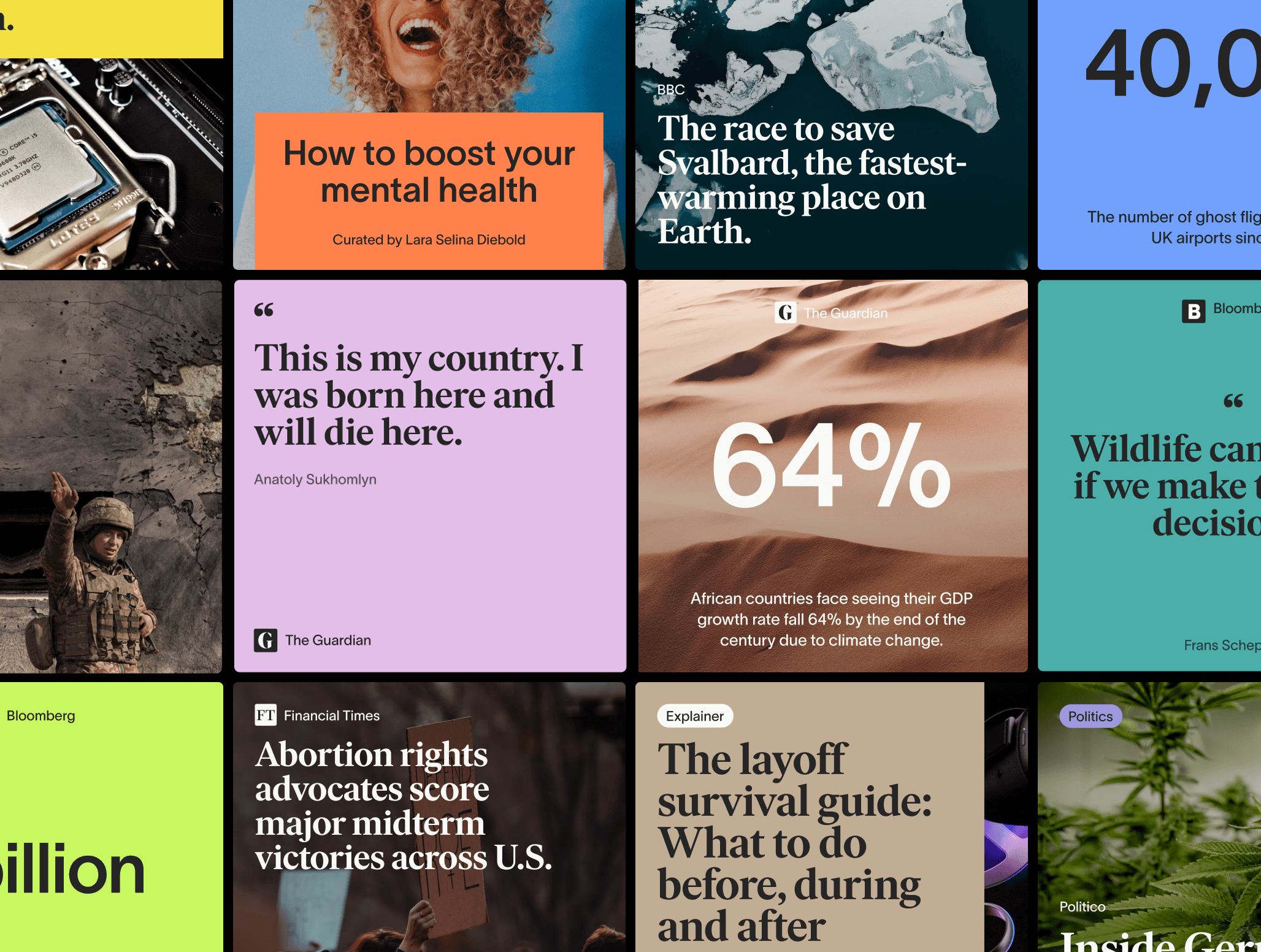
Strategy and concepts for organic social as a growth accelerator
Within ten months of the redesign and launch, the company gained 12k+ followers and 20% MoM growth on social media.
K — design, leadership, vision, strategy
Based in London.
© Katja Alissa Mueller, forever
Based in London.
© 2019, Katja Alissa Mueller
Based in London.
© 2019, Katja Alissa Mueller
katja.amueller@gmail.com
@katjaalissamueller